OKA Mobile App
Intro
OKA is a ground-breaking Startup revolutionizing access to residential and corporate construction works. Dubbed the “Uber of home renovation,” OKA aims to simplify the process of finding and hiring construction professionals. They approached me to bring their visionary ideas to life and enhance the UI/UX of their existing product. Collaborating closely with the OKA team, I led the development of two key deliveries. The first focused on the redesign of their client-facing app, providing seamless connections between homeowners, businesses, and skilled professionals. The second delivery involved an internal artist’s platform, empowering construction experts with an efficient workflow. After the MVP was shipped, the company was granted a multi-million funding and it’s now on its second version.
Design Process
Since we were dealing with an early-stage startup, it was important to ship the first product asap in order to validade it with the user base, also allowing for funding before moving into the next phase.

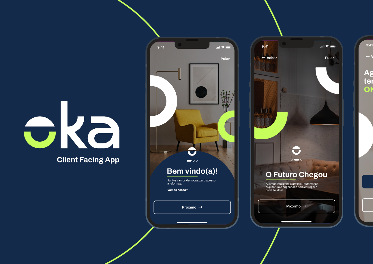
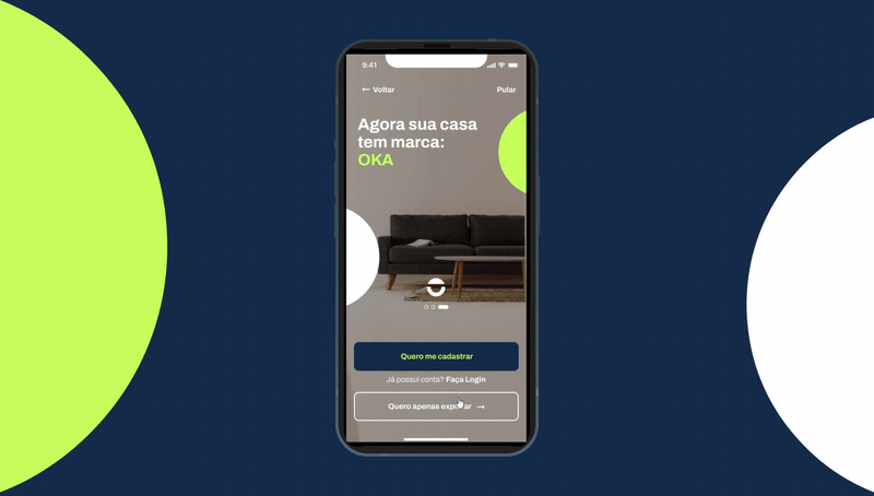
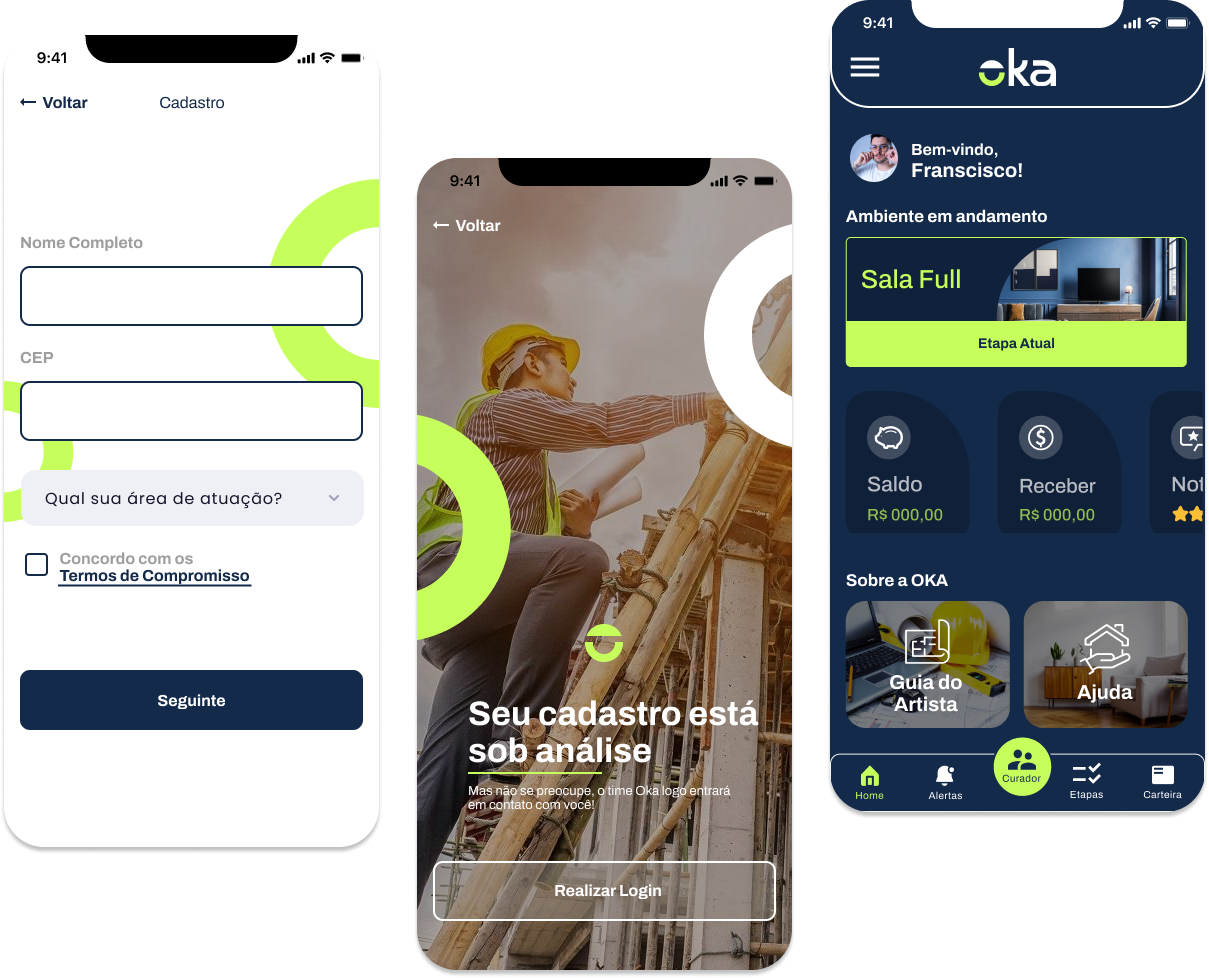
Part One — Existing App Redesign
For the first delivery, timing was crucial. The app was already in the development phase and needed an interface update in order to have a more modern look and few and follow the brand’s visual identity. Despite the short time, this phase also presented itself as an opportunity to improve the end-user experience through re-analysing the information architecture of the app.
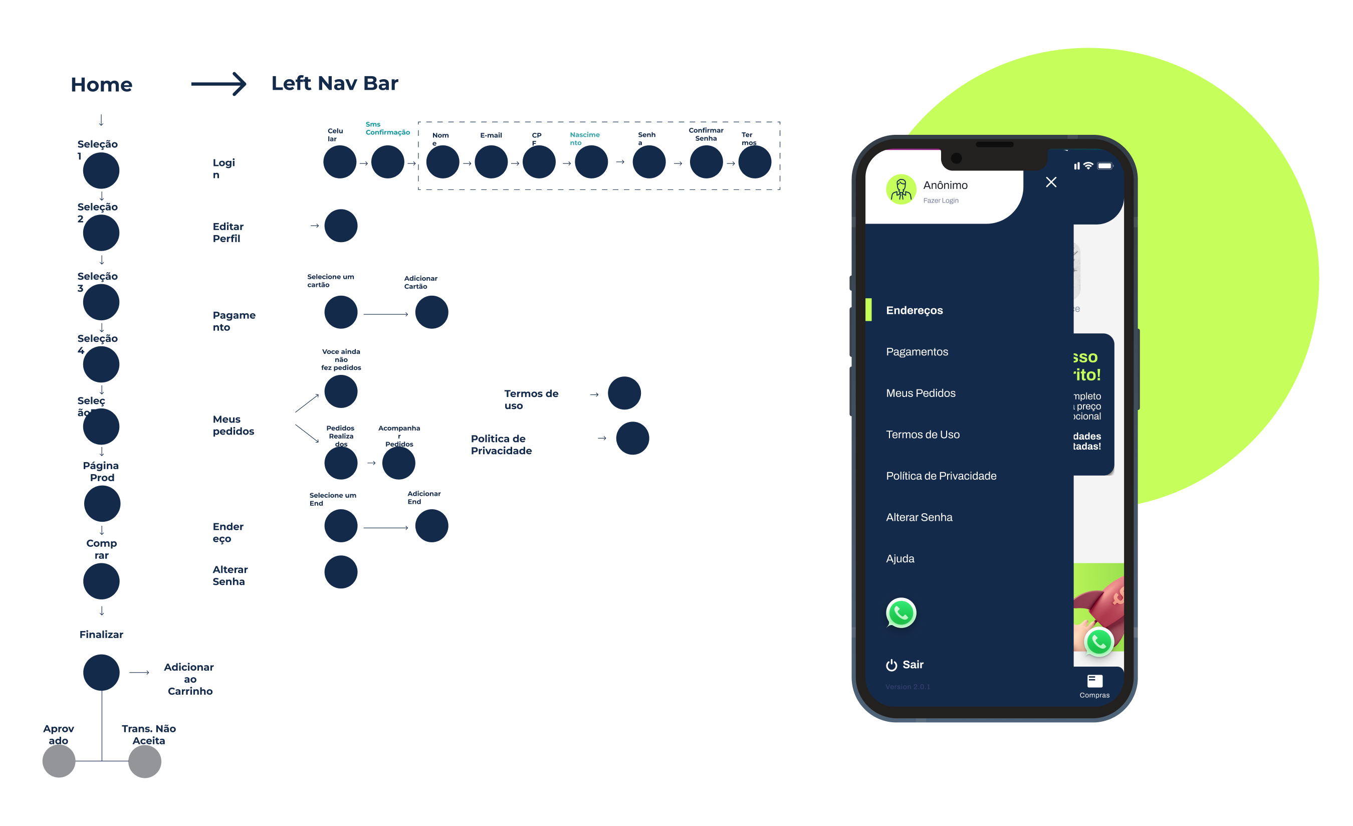
Information Architecture
Despite the project’s short timeframe, we conducted a thorough analysis of the app’s user flow, identifying areas for improvement. This led to rethinking flows, reducing cognitive load, emphasizing key content, and optimizing the information architecture. Through proposed modifications, we aimed to create a more intuitive and efficient user experience.
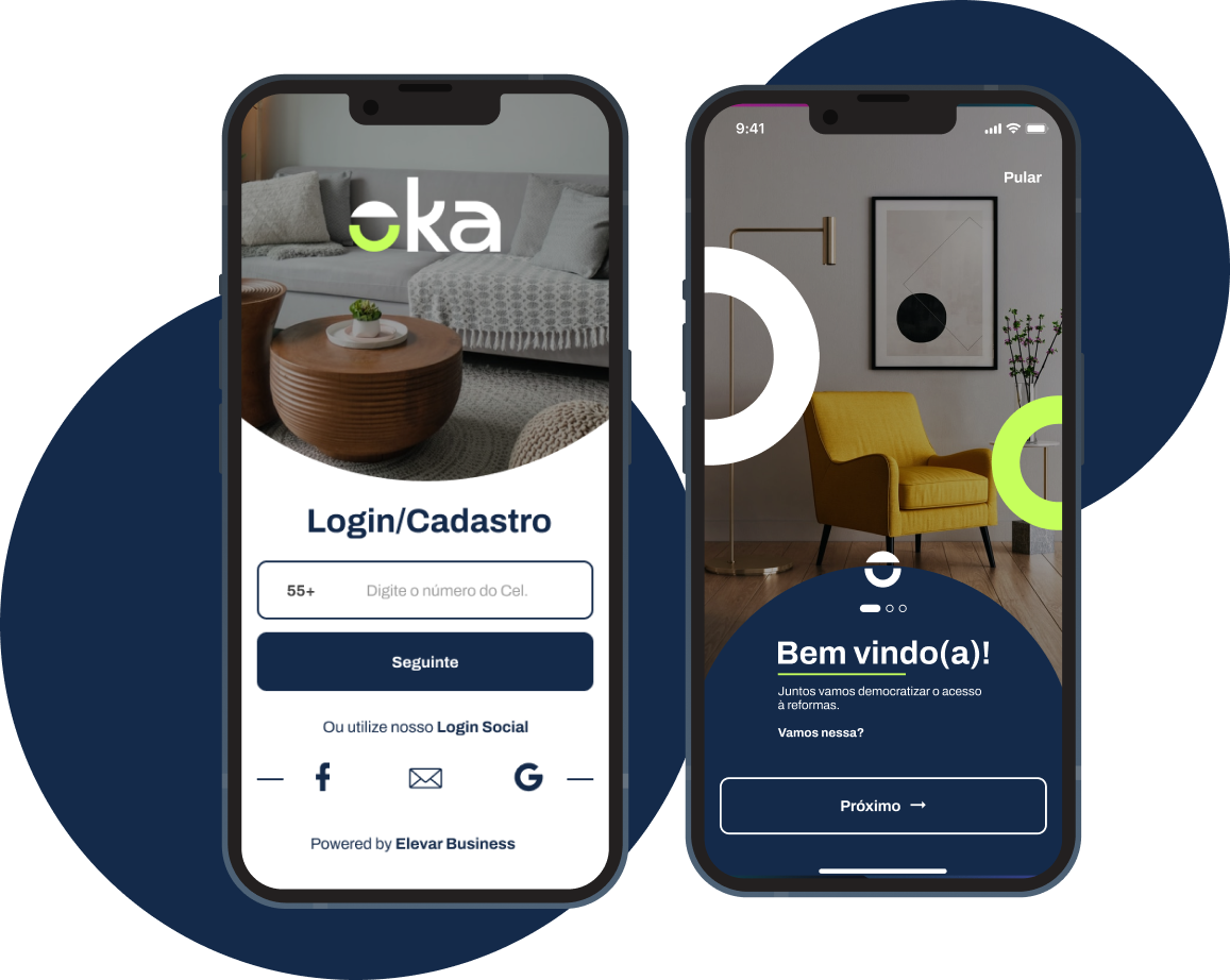
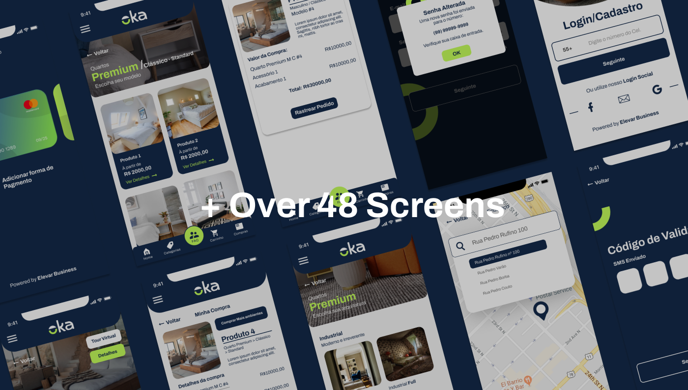
User Interface
For the UI enhancements, the first step was to create a base component and style library, following the brand’s visual identity. This allowed us to not only improve the visual hierarchy, but also the accessibility and look and feel of the application.
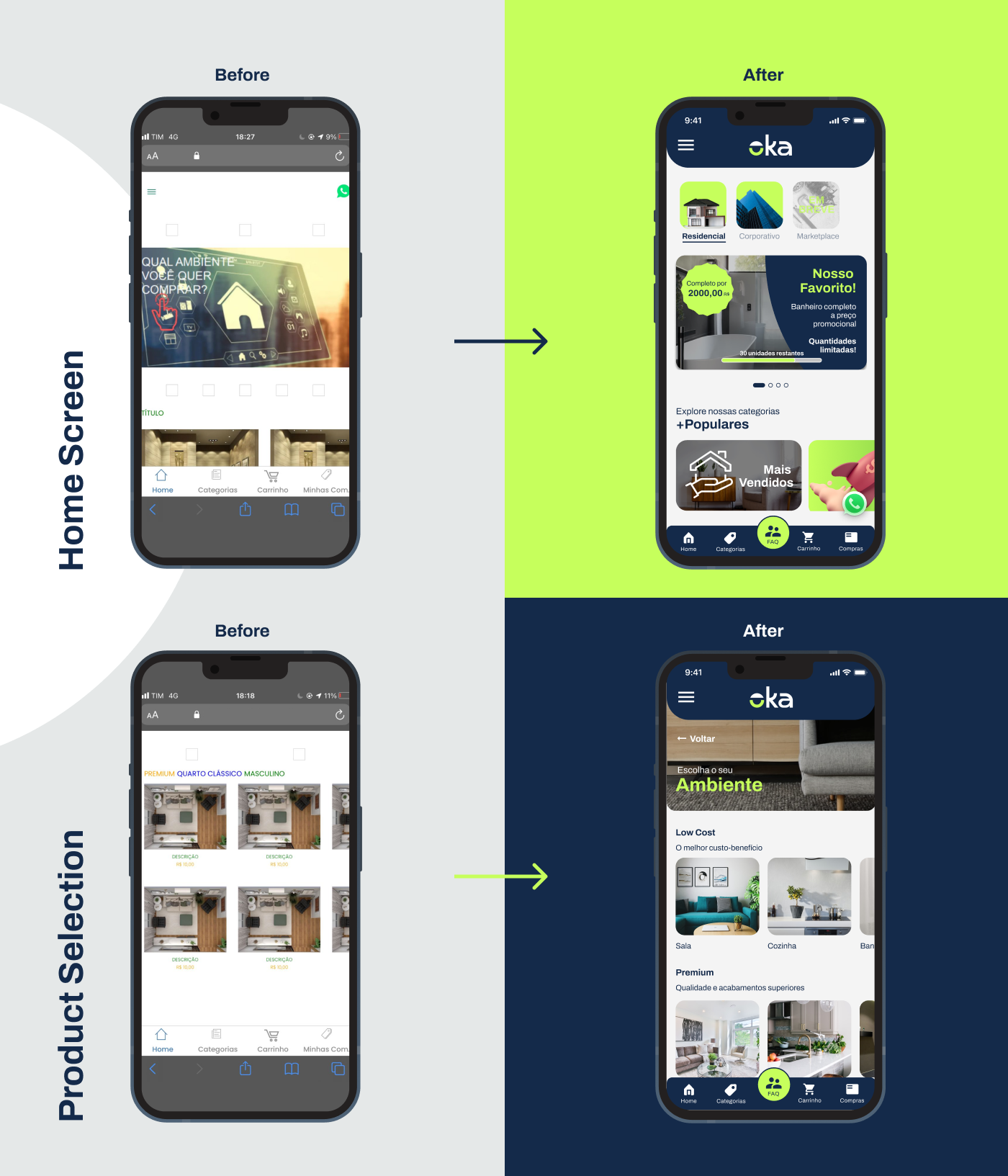
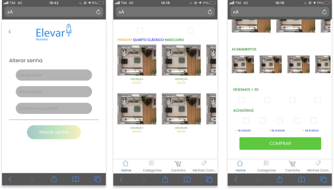
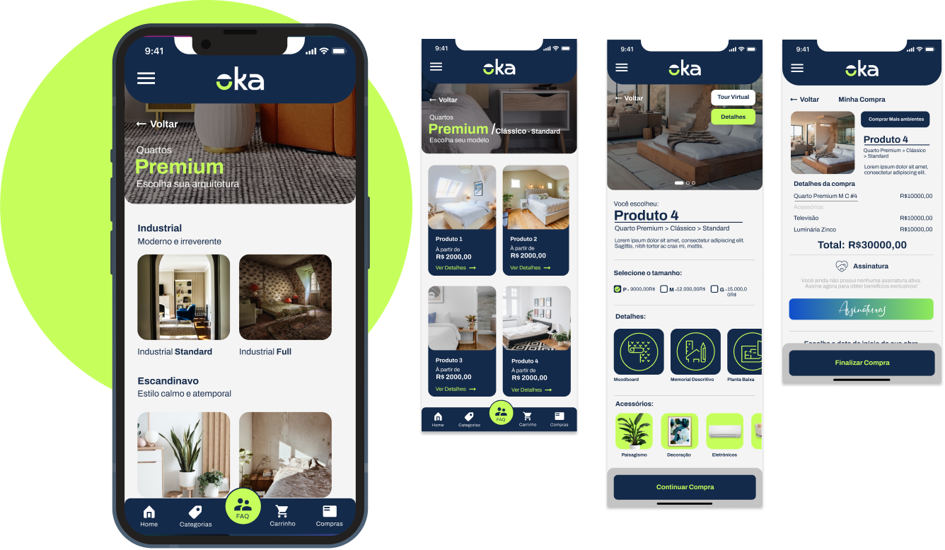
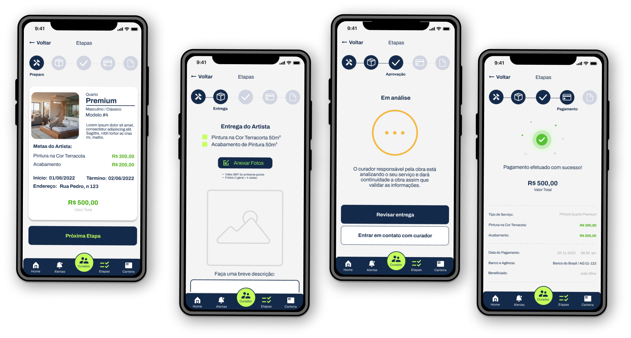
New Purchase Flow
The purchase process was made more intuitive and divided into more steps, in order to facilitate the understanding of the choice of product that has several customization steps.
Validation & Impact
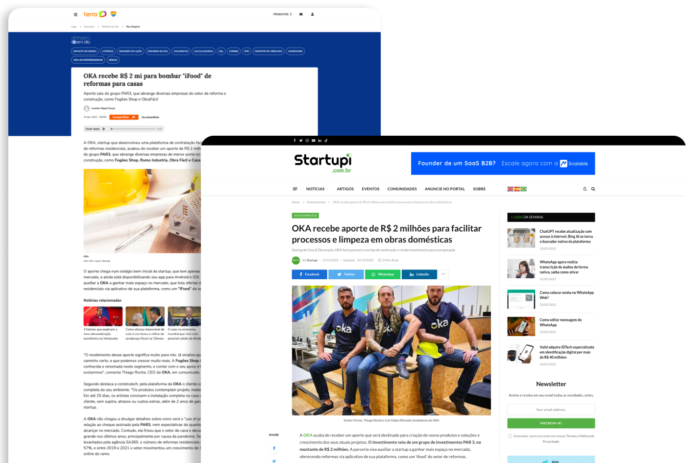
Following the successful delivery of the MVP, the OKA project received a significant million-dollar investment, propelling it into its second version. This infusion of funds enabled the project to undergo further development and refinement, expanding its features and capabilities.

Demo
Part Two — The Business’s Provider App
After the initial MVP was validaded, we were able to refine the features and work on a second app, which envolved a more complex workflow. This second application would be the place where the business’s providers would be able to get new jobs, control their tasks and update the customers in real time the status of their order.

Feature Mapping
Since this time we had more time for a more thorough discovery process, we started definying the features needed for this second application. This facilitated spotting all potential user journeys that the app could encompass, as well as identifying the necessary screens and functionalities. By visually representing these elements, we gained valuable insights into the app’s overall structure and user interactions, informing the subsequent design and development phases.
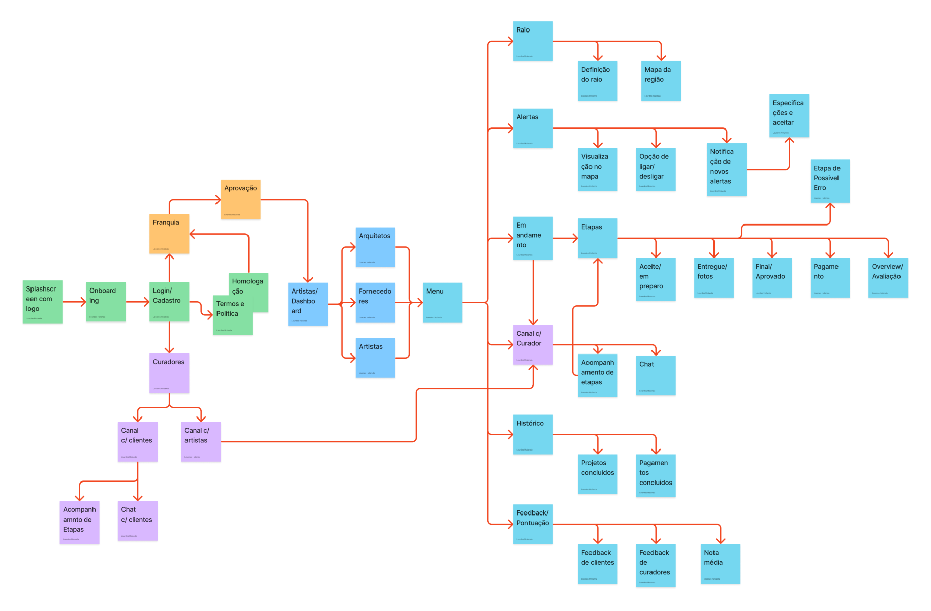
Wireframing
After mapping the user flow, we proceeded to create wireframes to establish the initial screen structure and diagram the functionality of each element. This step allowed us to visualize and refine the layout, interactions, and user interface components of the app. By developing wireframes and diagrams, we established a solid foundation for the subsequent design and development phases.
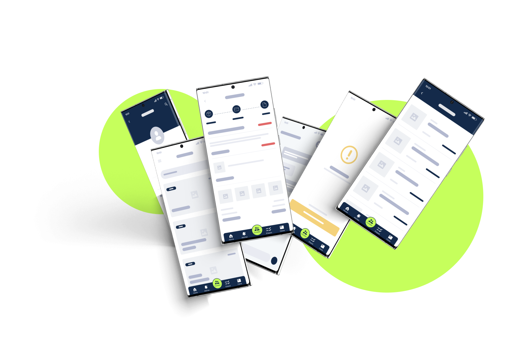
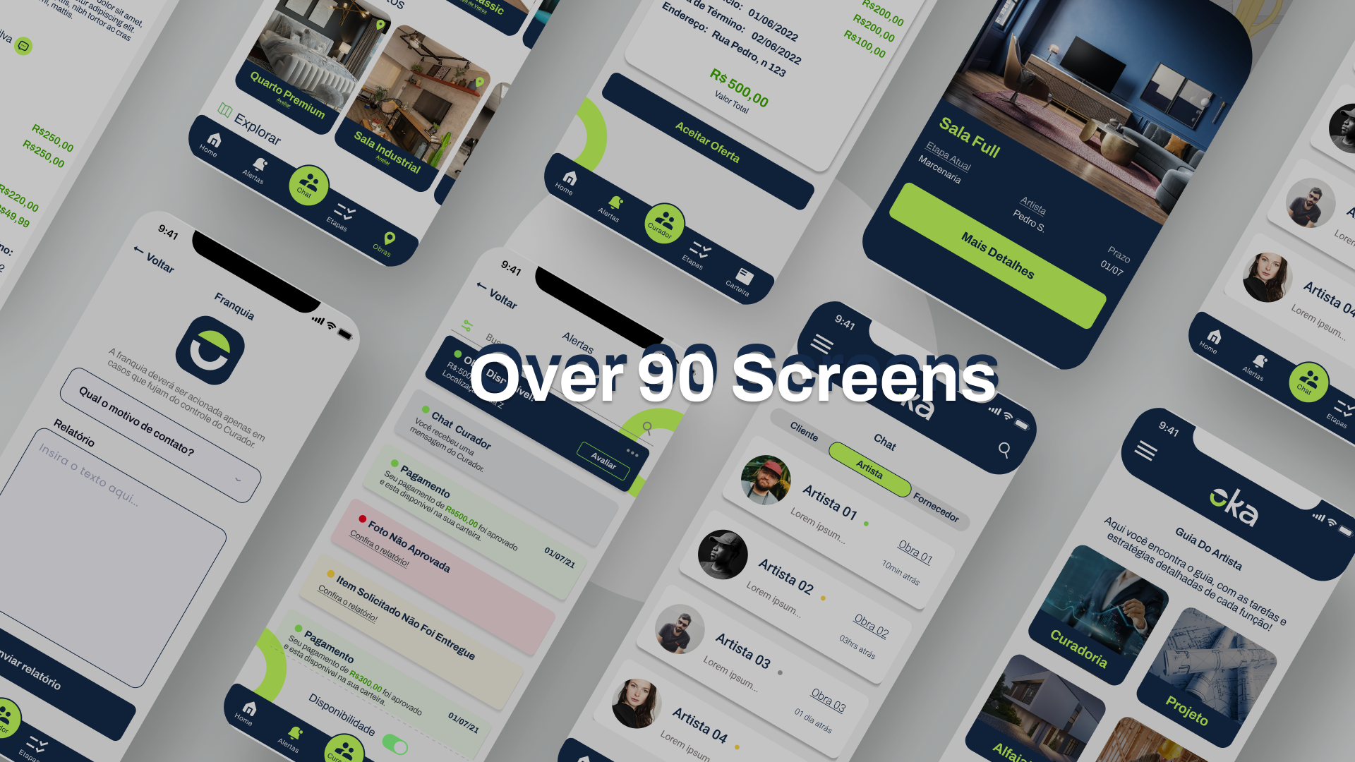
High Fidelity Prototype
After approving the wireframes, a High fidelity navigable prototype created with more than 90 screens covering all possible flows and variables.
Business Provider’s Wizard
A key feature of the app was to allow the client to follow the whole refurbishment process through the app. It was also important for the surpevisor to sign off the daily tasks, which was achieved by a simple interface where the artist can upload their daily progress.
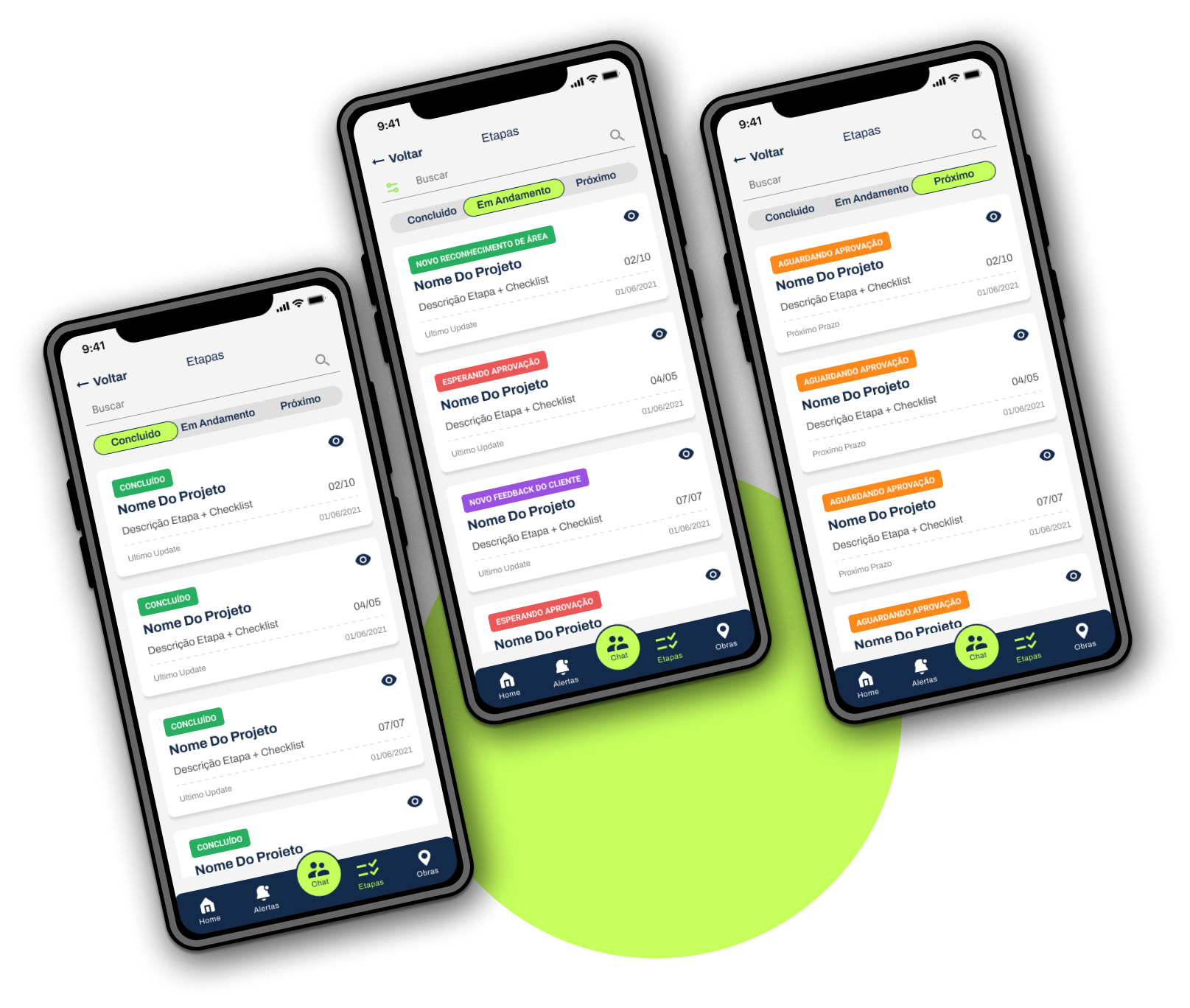
Task Dashboard
The curator plays the role of monitoring all stages of the project and its artists simultaneously, and having a macro view of what has already been completed and what is to come. The solution found was to create a Kanban board adapted for the mobile version.
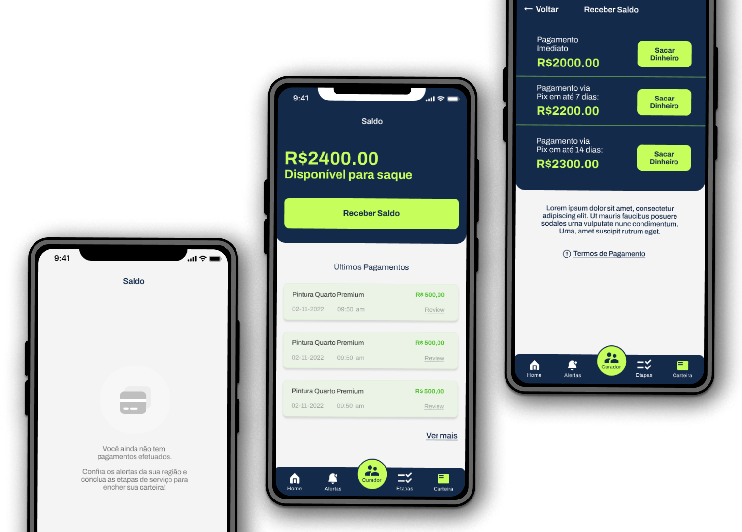
Wallet
Allowing for quick in-app payouts.
Delivery